What Makes a Great Restaurant Website (and What Drives Diners Away)
What diners actually check before picking a restaurant — menu, hours, ordering links, photos — and the mistakes that send them to a competitor instead.
When someone finds your restaurant through a search or a map, they aren't browsing casually. They're deciding, in the next few seconds, whether to send the address to friends or scroll past you to the next result. They don't want your brand story — they want a menu they can actually read, hours they can trust, and one obvious way to get a table or get food.
That's the entire job of a restaurant website. It isn't a brochure. It's the thing standing between a hungry person and a decision.
Diners want your menu, and they want it now
Your menu is the most-checked page on the site. If it's slow to open, hard to read on a phone, or missing entirely, most visitors won't dig for another way to find it — they'll just check the next place.
Build it as a real page, not a PDF
A lot of restaurant sites still link out to a PDF for the menu. On a phone that means downloading a file, pinch-zooming to read small type, and scrolling sideways to see prices. Some are even scanned images of a printed menu, so the text can't be searched or read by a screen reader.
Put the menu directly on the page as real text, organized by course, with dish names people can read without zooming. It loads faster, it's easier for you to update, and it lets someone use their phone's search to jump straight to "vegan" or "gluten-free" if that's what they need.
Keep prices flexible — or leave them off
Menu prices change more often than most owners get around to updating their site. Rather than let stale prices sit online and create an awkward moment at the register, some restaurants list dishes without prices and route visitors straight to their ordering platform, where pricing is always accurate. Either approach is fine. What doesn't work is a price list from two menus ago.
The two-minute menu test
Pull up your website on your phone, on cellular data instead of the restaurant's Wi-Fi. Open the menu. If you have to pinch-zoom, download a file, or wait more than a couple seconds, that's exactly what a hungry visitor is dealing with right now — and plenty of them won't push through it.
Hours, location, and a map that actually works
"Are they open right now?" is usually the second question, right behind "what's on the menu." If your hours are wrong, buried in a paragraph, or missing, you lose people who were ready to walk in.
- List hours plainly near the top of the page, and keep them identical to what's posted on Google and social media. Conflicting hours across platforms is one of the fastest ways to send someone to a competitor instead.
- Show your address as real text, not just inside an image, and link it to a proper map — Google Maps, not a generic graphic — so one tap gives someone directions.
- If you close for holidays or shift to seasonal hours, update the site before the date arrives, not after someone has already shown up to a locked door.
Keeping your website, Google Business Profile, and social pages in sync isn't glamorous, but it's the difference between a diner who trusts your hours and one who calls to double-check — or doesn't bother at all.
Give people a way to order or book without calling
Plenty of diners would rather tap through an order or reservation than call and wait on hold. If your site doesn't offer that path, you're pushing some share of potential customers toward whichever competitor makes it easy.
- Ordering. If you use Toast, Slice, a delivery app, or your own system, put an "Order Online" button where it can't be missed — not buried two clicks deep in a nav menu. Send people into the platform you actually run food through, so the order lands in your kitchen the way you expect.
- Reservations. If you take bookings through OpenTable, Resy, or a simple booking widget, link it directly from the homepage.
- Walk-in only? Say so. "No reservations needed — first come, first served" is a perfectly good answer, and it saves someone the trouble of hunting for a booking button that was never going to exist.
You don't need to build a booking or ordering system yourself. You just need to point people, in one obvious tap, at whatever system you already run.
Photos of your actual food and your actual room
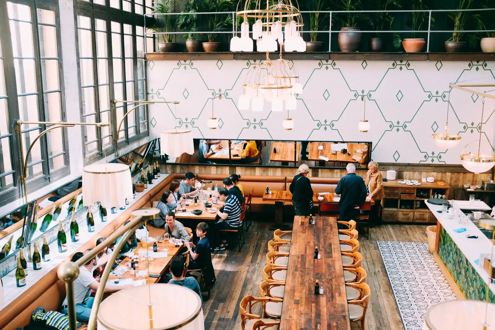
Appetite is visual. A handful of honest photos of your best dishes and your dining room tell a visitor more in two seconds than three paragraphs of description ever will.
- Use real photos of dishes you actually serve, not stock photography of food that looks nothing like what leaves your kitchen. A diner who orders the pasta from your photo and gets something different loses trust fast.
- Show the room, not just the plates. People are also deciding whether the space fits the occasion — a quick lunch, a date night, a table for six.
- Skip the heavy filters. Natural light and a clean plate beat an over-processed photo that reads as fake.
If you don't have great photos yet, a few well-lit shots of your signature dishes will do more for the site than a large gallery of mediocre ones.
Handle dietary and allergen questions before someone has to ask
More diners are checking for dietary information before they ever call the restaurant. If your menu doesn't note common allergens or mark which dishes are vegetarian, vegan, or gluten-free, you're leaving people to guess, or to call and interrupt your staff during a rush.
Simple tags next to each dish — V, GF, contains nuts — cover most of it. If you want a reference for talking about major allergens accurately, the FDA's guidance on food allergies is a reasonable starting point. You don't need a legal document, just enough clarity that someone with a real restriction can tell, before they arrive, whether they'll have options.
Give catering and private events their own page
If you handle catering, private parties, or buyouts, don't bury that behind a footer link or leave it off the site entirely. Give it a real page describing what you offer, roughly how it works, and a way to reach you — even a short inquiry form is enough. Event planning usually starts well before anyone sets foot in your dining room, and if they can't find that information on your site, they'll find a restaurant down the street that has it.
Build it for the phone in someone's hand
Most people deciding where to eat are doing it on a phone — standing outside, sitting in a car, or scrolling between errands. A restaurant site designed for a desktop screen and shrunk down to fit a phone almost always shows it: text too small to read, buttons too close together to tap accurately, photos that crawl to load on a spotty connection.
Mobile-first means the phone version is the real design, not an afterthought: large enough tap targets on the order button, fast-loading photos, and a menu that never requires pinch-zooming to read a single word.
What drives diners away
Most of the damage comes from the flip side of everything above. If any of these sound familiar, it's worth an honest look at your site:
- An outdated or missing menu. Dishes you no longer serve, prices from last year, or no menu at all.
- Hours that are wrong or hard to find. Especially when they don't match what's posted on Google or social media.
- A menu locked in a PDF. Slow to open, awkward to read on a phone, and often invisible to search engines.
- No ordering or reservation link. Forcing a phone call when a diner expected a tap.
- Slow load times or a clumsy mobile layout. Every extra second on a shaky connection loses people who were ready to say yes.
- No real photos, or none at all. Stock food photos, or a page with just text, give a hungry visitor nothing to be tempted by.
Every item on that list is a specific, fixable thing, not a reason to tear the whole site down — unless most of it describes your site at once.
For a broader look at the fundamentals every local business site needs, see The Local Business Website Checklist. And if your site already gets visitors but the phone still isn't ringing, Why Your Website Isn't Getting Calls walks through the usual reasons.
That's usually the moment it makes more sense to rebuild than to keep patching. At StoopCraft, we build the site for you — real menu, real photos, hours and ordering links wired up the way your restaurant actually runs — and you look at the finished preview, typically within a couple hours, before deciding whether to move forward. No card required to see it, and if you do, it's a flat $69 a month that covers hosting, your custom domain, and as many edits as your menu needs.
Frequently asked questions
- Should my restaurant website have online ordering built in, or just link out to a platform?
- Linking out to whatever platform you already use to run food — Toast, Slice, a delivery app, or your own system — is usually the better choice. It keeps orders flowing into the system your kitchen already relies on, instead of asking you to maintain a second ordering setup on your website.
- Do I need to put prices on my menu page?
- Not necessarily. Prices change more often than most sites get updated, and a stale price list creates an awkward moment at checkout. Many restaurants list dishes without prices and send visitors to their ordering platform, where pricing is always current.
- Is a PDF menu really that big of a problem?
- For most diners on a phone, yes. PDFs are slow to open, hard to read without pinch-zooming, and often invisible to search engines, so dishes you actually serve don't turn up when someone searches for them. A real webpage menu loads faster and is far easier to keep current.
- How do I handle dietary and allergen information without overcomplicating the menu?
- Simple tags next to each dish — vegetarian, vegan, gluten-free, contains nuts — cover most questions. Add a short note asking guests with specific concerns to tell staff when ordering, and you've covered the rest without turning your menu into a legal document.