What Makes a Great Dental Practice Website (and What Sends Patients Elsewhere)
What actually earns a new patient's booking: real online scheduling, clear insurance info, team bios, and the choices that send patients elsewhere instead.
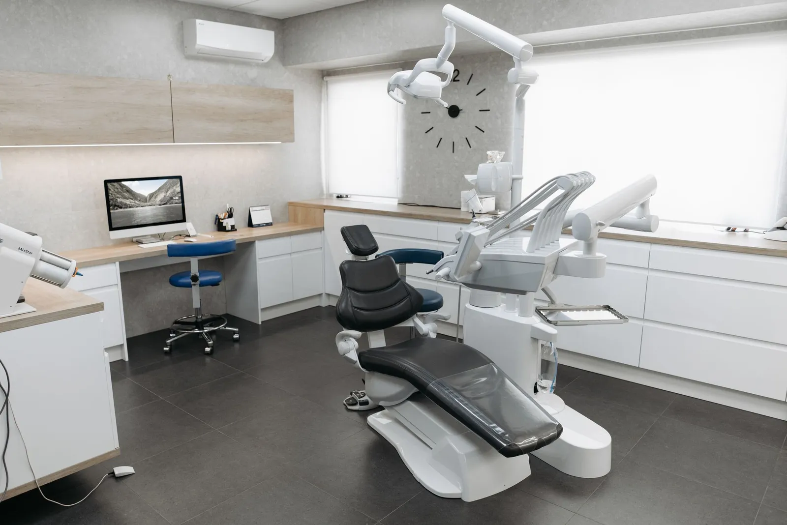
A new patient doesn't wander onto a dental website out of curiosity. They usually arrive already deciding — a tooth hurts, their insurance changed, they just moved to town and typed "dentist near me" into their phone. In that moment they're not evaluating your logo or your color palette. They're scanning for a handful of specific answers: are you taking new patients, does your office work with their insurance, can they get on the schedule without waiting on hold, and does this practice look like somewhere they'd actually want to sit in a chair.
Most dental websites answer maybe half of that. Here's what a site needs to cover to earn the call, or the booking, instead of losing that visitor to the next practice in the search results.
What patients are checking before they book
1. A real way to book, not just "call our office"
Some patients still prefer to call, and that's fine. But plenty would rather request a time online, especially outside office hours when the phone isn't picked up anyway. If the only option on your site is a phone number, you're asking every visitor to take the one extra step that's easiest to abandon.
This doesn't have to mean a full self-service scheduling system tied into your practice management software, though that's the strongest version if you have it. A simple appointment-request form — name, phone, preferred day, new or existing patient — that lands directly with your front desk covers most of the same ground. What matters is that a patient can start the process without picking up the phone, and that whatever they submit doesn't disappear into an inbox nobody checks.
2. "New patients welcome," stated plainly
If you're accepting new patients, say so on the first screen someone sees, not buried in an FAQ. It sounds obvious, but a lot of practice sites read as if they were written for people who are already patients — appointment reminders, portal logins, copy that references "your provider" with no context. Someone who's never been to your office needs to be told clearly that there's room for them.
If you run new-patient specials, like a reduced-cost exam and cleaning for first visits, that's worth its own section rather than a line buried in your services page. Just keep the offer current — an expired special is worse than no special at all.
3. Services broken out the way patients think about them
"General, cosmetic, and restorative dentistry" on one page tells a patient almost nothing about whether you handle what they actually need. Someone with a chipped tooth, someone asking about whitening, and a parent looking for a dentist their kid won't dread are all searching in different language for different things.
Break out real service categories — general and preventive care, cosmetic work, emergency visits, orthodontics or pediatric care if you offer them — with enough detail that a visitor can tell whether you're the right fit before they ever pick up the phone. If a service usually requires a referral to a specialist, saying so up front saves everyone a wasted call.
4. Insurance accepted, stated without hedging
"We accept most insurance" answers nothing. Patients want to know if their specific plan works with your office, and whether you're in-network or simply willing to file out-of-network claims for them — those are different things with different costs attached.
List the insurance providers you're in-network with by name. If you also accept out-of-network plans, explain briefly what that means for the patient's bill. If coverage genuinely varies too much to summarize on a page, say that honestly and give a way to check before the visit, rather than leaving people to guess.
Don't blur "we accept insurance" with "we're in-network"
These two get used interchangeably on a lot of dental sites, but they mean very different things for a patient's wallet. In-network means your negotiated rate applies; out-of-network usually means the patient pays more up front and files for reimbursement themselves. Getting this distinction wrong on your website sets up a bad conversation at the front desk later — say exactly what's true for each plan you list.
5. Payment and financing options, spelled out
Cost is one of the most common reasons people put off dental care, and a website that's silent on the subject leaves patients to assume the worst. If you offer payment plans, a financing partner, or a membership plan for uninsured patients, describe it in plain terms — what it covers, roughly how it works. Skip exact monthly payment figures, since those depend on the individual treatment plan and credit approval, but don't make people call just to find out financing exists at all.
6. Providers and team members, with real credentials
Letting a stranger work in your mouth is a different kind of trust than most local purchases. A bio with a real photo, the dentist's education, years in practice, and any specialty training goes a long way toward answering the unspoken question of who's actually about to treat you.
This matters for hygienists and the front-office team too, even in shorter form. A practice that reads as a group of real people, not a logo and a stock photo of a smiling model, builds trust before a single review gets read.
7. Patient reviews that are actually yours
Star ratings help, but a handful of real reviews in patients' own words — mentioning specifics like a gentle hygienist or a same-day emergency visit — do more to move someone from "maybe" to "booked" than a badge alone. Pull from your actual Google reviews rather than writing testimonials yourself, and refresh them periodically so the newest one isn't three years old.
8. Real photos of the office, not stock dental imagery
Generic stock photography of dental equipment or an unnaturally white smile reads as exactly what it is, and it can work against you — a stark closeup of an instrument does nothing to calm someone who's already anxious about the visit. Real photos of your actual waiting room, treatment rooms, and team tell a patient what to expect, and tend to read as warmer than clinical stock imagery even when the equipment itself looks identical.
9. New-patient paperwork available ahead of time
Handing someone a clipboard the moment they walk in is one of the more dated parts of a dental visit. If your intake forms — medical history, insurance information, consent forms — are available as a download or a fillable form ahead of the appointment, patients can fill them out at home instead of rushing through them in the waiting room, and your front desk saves the time of chasing paper afterward.
10. Contact info, hours, and directions that don't require digging
Phone number, address, and hours belong somewhere visible on every page, not just a contact page three clicks deep. Link your address to an actual map rather than a static image, and keep your hours identical across your website, your Google Business Profile, and any directories you're listed in. Mismatched hours are a common way practices lose a walk-in or a same-day patient who shows up at the wrong time.
11. Accessibility for patients who need it
Dental patients include people with mobility limitations, vision differences, and anxiety conditions that make a first visit harder than it needs to be. A website that's readable at a larger font size, navigable without a mouse, and clear about physical accessibility — wheelchair access, parking, sedation options if you offer them — removes a real barrier for some share of the people trying to reach you. The Americans with Disabilities Act governs how practices serve patients generally, and a website that's hard to use is its own version of that same problem.
What sends patients elsewhere
Most of what pushes a visitor to hit back and try the next search result isn't dramatic. It's small friction, repeated enough times that someone gives up.
No online booking, or a booking button that goes nowhere
A "Schedule Now" button that opens a blank contact form with no confirmation, or links to a portal that requires an existing login, is arguably worse than no button at all — it promises something and then fails to deliver it. Test your own booking path the way a new patient would, on a phone, and see what actually happens.
Insurance and pricing left vague on purpose
Some practices avoid insurance and cost information because the honest answer is "it depends." That's understandable, but silence reads as evasiveness to a patient trying to plan around a monthly budget. A brief, honest explanation of how it depends beats saying nothing at all.
A cold, dated, or overly clinical design
A site that still looks like it was built a decade ago — small text that isn't mobile-friendly, a stock photo of a person mid-drill, no sense of who actually works there — offers a nervous patient nothing reassuring. Dental anxiety is common enough that tone matters more here than it does for a lot of other local businesses.
No idea who's actually going to treat you
A practice site that talks entirely about "our office" and "our services" without ever introducing a person leaves a real question unanswered. People choose a provider, not just a building.
A slow, broken mobile experience
Most people looking for a dentist are doing it on a phone, often with a little urgency behind it. A page that takes several seconds to load, or a layout that requires pinch-zooming to read, loses people who would otherwise have booked. If you're not sure whether that describes your own site, The Local Business Website Checklist walks through how to check the fundamentals, and Why Your Website Isn't Getting Calls covers the conversion side in more depth.
None of this requires rebuilding your practice's whole image — it's mostly about making sure the handful of things a new patient is actually looking for aren't missing or buried three clicks deep. That's the part StoopCraft handles for the dental practices we work with: we build the site first, as a free preview you can look over before you pay anything, so the booking path, the insurance page, and the team bios are already in place before you commit to any of it.
Frequently asked questions
- Do I need real online scheduling, or is a request-an-appointment form enough?
- A request form that reaches your front desk covers most of the same ground as full self-service scheduling, as long as someone follows up quickly. What matters more than the specific tool is that a patient can start the process without picking up the phone — true online booking tied into your practice management software is the stronger option if you already have it, but it's not the only way to solve this.
- Should I list every insurance plan we accept, or just the major ones?
- List them all if you can keep the list current. An incomplete list either makes someone assume you don't take their plan or leaves them to call and ask, which is the exact friction a clear list is meant to avoid. If your accepted plans change often, note when the list was last updated so patients know to double-check anything recent.
- Do I need a bio for every provider, or just the lead dentist?
- The lead dentist's bio matters most, but a shorter bio for any associate dentists and hygienists patients are likely to see helps too. Patients choosing a dental practice are choosing the person who's going to be in the room with them, not just the name on the sign.
- Is it worth mentioning sedation or anxiety-friendly options on the website?
- If you genuinely offer them, yes. Dental anxiety is common enough that a brief, honest section on how you handle nervous patients — extra time, nitrous oxide, sedation options, whatever you actually provide — can be the deciding factor for someone who's been putting off a visit. Don't imply an option you don't actually offer, since that's the kind of thing a patient discovers the moment they ask about it.